
Bootstrap CSS based
The package themes based on Twitter Bootstrap CSS framework are the following:
diazoframework.bootstrap
The diazoframework.bootstrap package provides the diazo framework implementation of the Twitter Bootstrap CSS framework using the theming and packaging features available in the diazoframework.plone core package for create Diazo theme using plone.app.theming.
Note
They are useful for creating themes based on Twitter Bootstrap CSS framework provides the framework resources and diazo rules to reuse and add to in a Diazo theme. For documentation on the framework itself, check the website.
diazotheme.bootstrap
The diazotheme.bootstrap package is a Diazo Theme based on the diazoframework.bootstrap package. This add-on included the following themes:
Twitter Bootstrap Starter Theme
Technical details:
- DOCTYPE HTML: HTML5
- Stylesheet: CSS
- JS support?: jQuery
- Web fonts?: No
- Grid support?: Yes
- Responsive?: Yes
- CSS framework: Twitter Bootstrap CSS framework
- Supported versions: Plone 4
The Twitter Bootstrap Starter Theme aka starter, is a diazo theme that use with Sunburst Theme. A demo using it looks like the following:
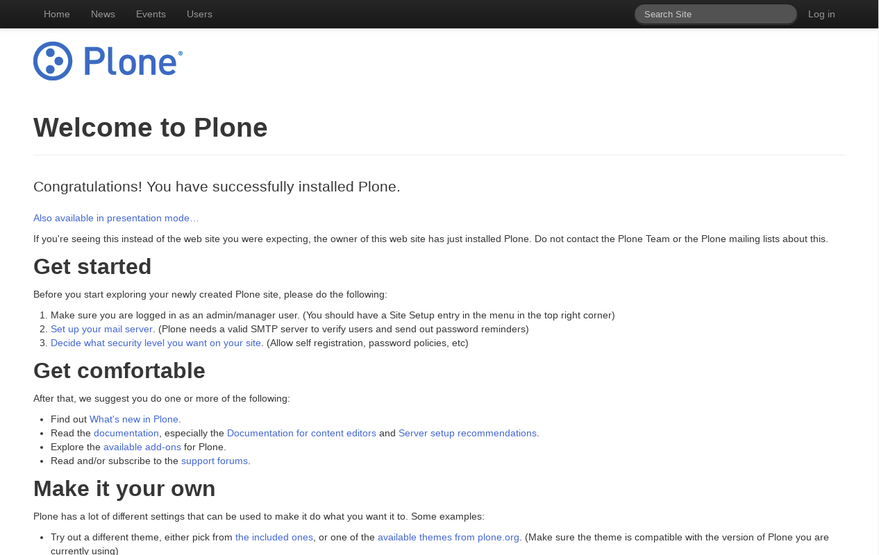
Twitter Bootstrap Starter Theme Demo at Plone front-page.
Twitter Bootstrap Hero Theme
Technical details:
- DOCTYPE HTML: HTML5
- Stylesheet: CSS
- JS support?: jQuery
- Web fonts?: No
- Grid support?: Yes
- Responsive?: Yes
- CSS framework: Twitter Bootstrap CSS framework
- Supported versions: Plone 4
The Twitter Bootstrap Hero Theme aka theme, is a diazo theme that use with Sunburst Theme. A demo using it looks like the following:
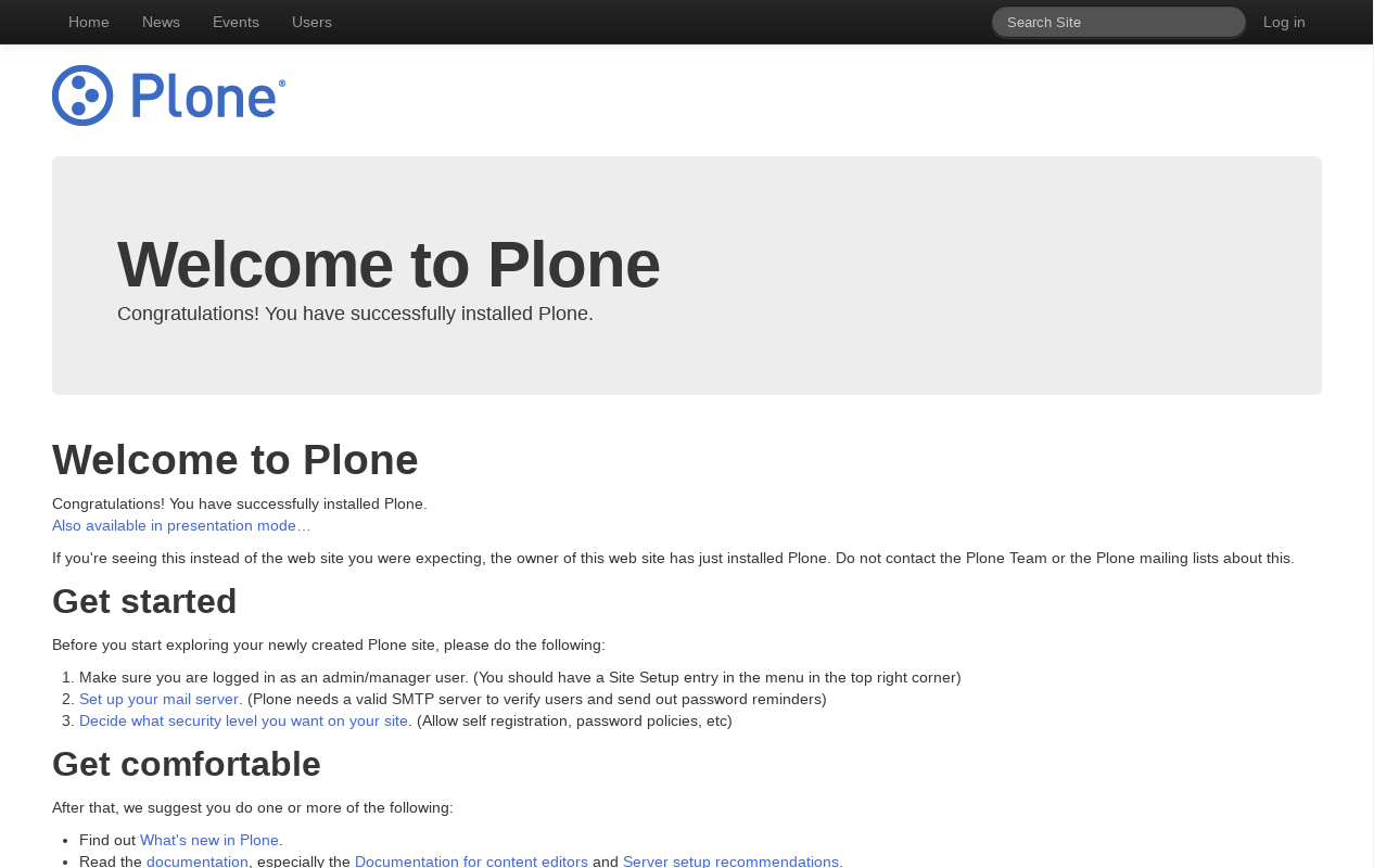
Twitter Bootstrap Hero Theme Demo at Plone front-page.
Twitter Bootstrap Marketing Narrow Theme
Technical details:
- DOCTYPE HTML: HTML5
- Stylesheet: CSS
- JS support?: jQuery
- Web fonts?: No
- Grid support?: Yes
- Responsive?: Yes
- CSS framework: Twitter Bootstrap CSS framework
- Supported versions: Plone 4
The Twitter Bootstrap Marketing Narrow Theme aka marketing-narrow, is a diazo theme that use with Sunburst Theme. A demo using it looks like the following:
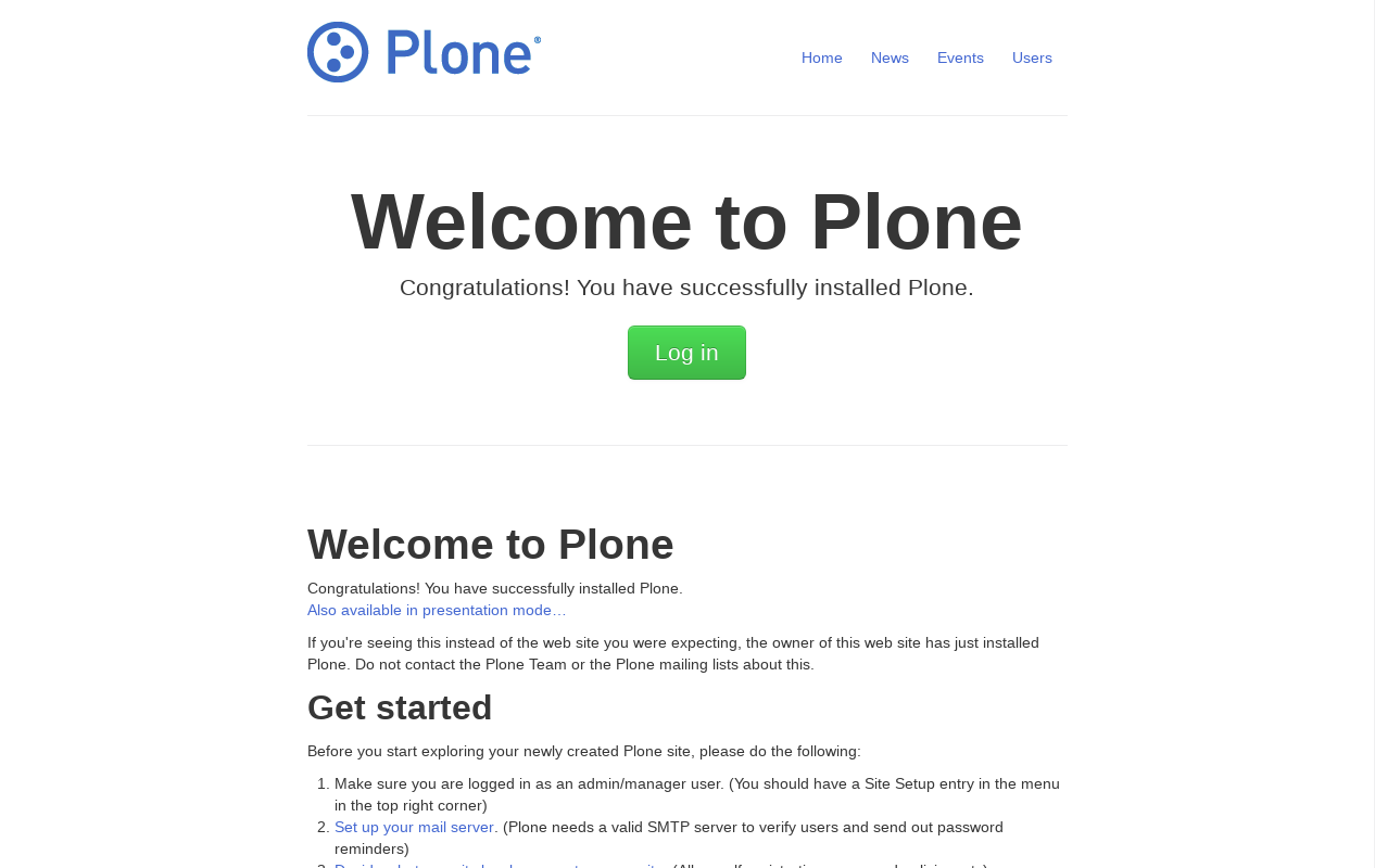
Twitter Bootstrap Marketing Narrow Theme at Plone front-page.
example.bootstrap
The example.bootstrap package include the following Technical details:
- DOCTYPE HTML: HTML5
- Stylesheet: CSS/LESS
- JS support?: jQuery
- Web fonts?: No
- Grid support?: Yes
- Responsive?: Yes
- CSS framework: Twitter Bootstrap CSS framework
- Supported versions: Plone 4
The resources of this theme can be reached through
/++bootstrap++less- To access to LESS resources files.
/++bootstrap++js- To access to jQuery resources files.
/++bootstrap++img- To access to images resources files.
There are placed at example.bootstrap/src/example/bootstrap/resources
directory with following resources files:
resources/
├── img
│   ├── glyphicons-halflings.png
│   └── glyphicons-halflings-white.png
├── js
│   ├── bootstrap-alert.js
│   ├── bootstrap-button.js
│   ├── bootstrap-carousel.js
│   ├── bootstrap-collapse.js
│   ├── bootstrap-dropdown.js
│   ├── bootstrap-modal.js
│   ├── bootstrap-popover.js
│   ├── bootstrap-scrollspy.js
│   ├── bootstrap-tab.js
│   ├── bootstrap-tooltip.js
│   ├── bootstrap-transition.js
│   ├── bootstrap-typeahead.js
│   ├── README.md
│   └── tests
│       ├── index.html
│       ├── unit
│       │   ├── bootstrap-alert.js
│       │   ├── bootstrap-button.js
│       │   ├── bootstrap-collapse.js
│       │   ├── bootstrap-dropdown.js
│       │   ├── bootstrap-modal.js
│       │   ├── bootstrap-popover.js
│       │   ├── bootstrap-scrollspy.js
│       │   ├── bootstrap-tab.js
│       │   ├── bootstrap-tooltip.js
│       │   ├── bootstrap-transition.js
│       │   └── bootstrap-typeahead.js
│       └── vendor
│           ├── jquery.js
│           ├── qunit.css
│           └── qunit.js
└── less
    ├── accordion.less
    ├── alerts.less
    ├── badges.less
    ├── bootstrap.less
    ├── breadcrumbs.less
    ├── button-groups.less
    ├── buttons.less
    ├── carousel.less
    ├── close.less
    ├── code.less
    ├── component-animations.less
    ├── dropdowns.less
    ├── forms.less
    ├── grid.less
    ├── hero-unit.less
    ├── labels.less
    ├── layouts.less
    ├── mixins.less
    ├── modals.less
    ├── navbar.less
    ├── navs.less
    ├── pager.less
    ├── pagination.less
    ├── popovers.less
    ├── progress-bars.less
    ├── reset.less
    ├── responsive.less
    ├── scaffolding.less
    ├── sprites.less
    ├── tables.less
    ├── thumbnails.less
    ├── tooltip.less
    ├── type.less
    ├── utilities.less
    ├── variables.less
    └── wells.less
A demo using the example.bootstrap add-on look like the following:
Todo
TODO Add a example.bootstrap screenshot